Anti-waste organic produce, close to home
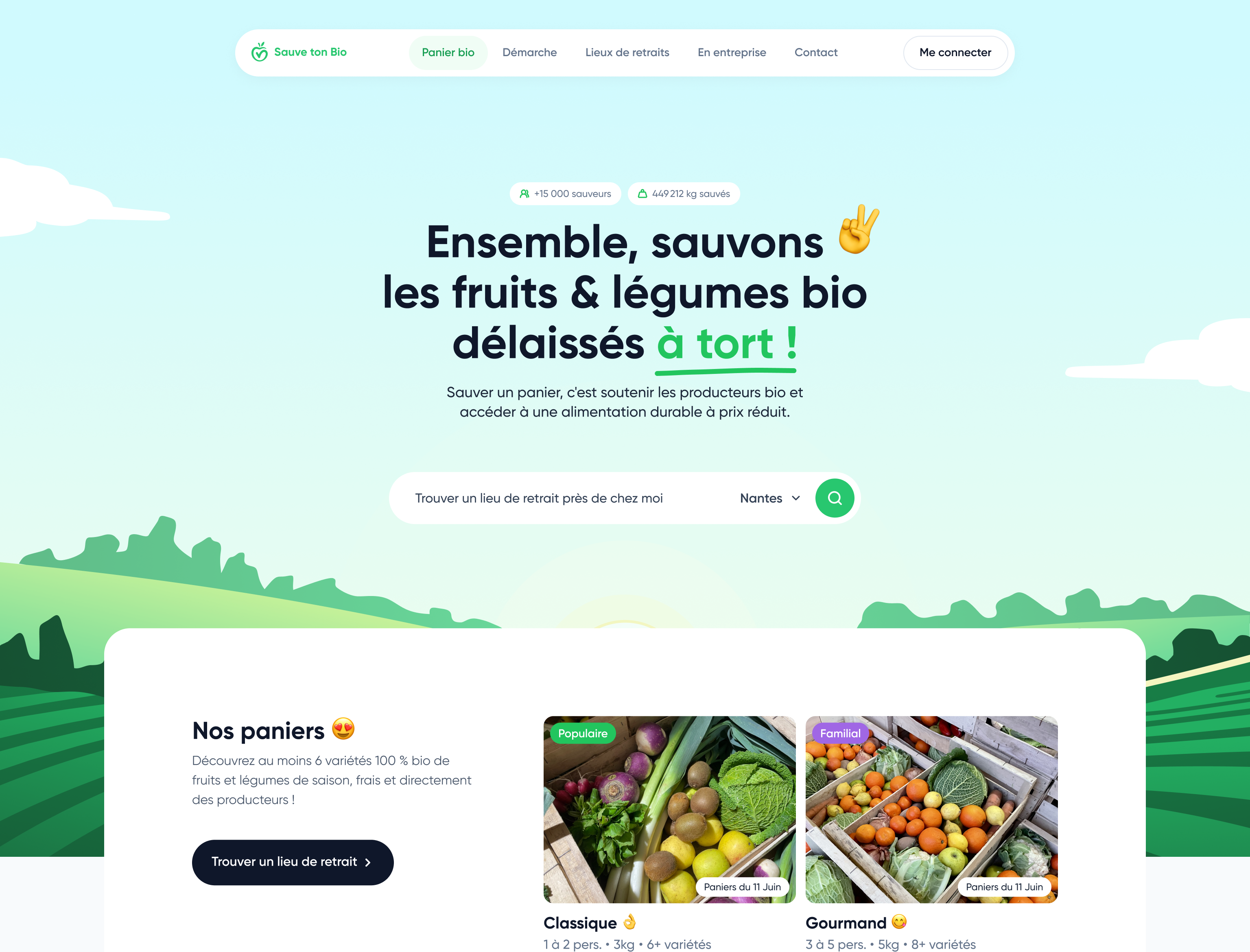
The landing page converts visitors by leading with impact (produce rescued, reduced prices, local supply chain) and pointing them to a nearby pickup point — no commitment, no subscription.
Client
Sauve ton Bio
Year
2025
Role
Product designer & developer
Stack
React
The context
A large share of organic fruit and vegetables is kept out of distribution for cosmetic or logistical reasons, even though it is perfectly edible. Sauve ton Bio rescues this "wrongly rejected" produce and offers it as seasonal baskets at reduced prices. The website had to carry that double promise — supporting growers and eating better for less — while turning interest into a first order and driving app downloads.
The approach
1. State the mission on the first screen
The hero states the intent ("Together, let's rescue the organic fruit & veg that were wrongly left behind!") in a warm, engaging tone. The farmland illustration immediately anchors a local, reassuring world, far from the cold conventions of classic e-commerce.
2. Convert through proof, not through talk
Rather than long arguments, concrete numbers pace the page (users, baskets rescued, kilos of produce saved). These counters work as both social proof and a reminder of impact, giving the purchase meaning.
3. Reduce friction at the door
The pickup-point search bar sits right in the hero: in one move, visitors check whether the service is available near them, before committing to anything. The "no subscription" promise removes one of the main objections.
4. Make the offer tangible
The baskets (Classique, Gourmand) are presented with photos, struck-through prices and what's actually in them today. Showing the real seasonal produce turns an abstract idea ("rescued organic food") into something desirable and immediate.

What I took away
- A landing page has to commit to a clear angle: here, anti-waste and the "no subscription" promise become the real conversion arguments, distinct from the app's.
- Numbers tell the story better than arguments: quantified impact carries the message far more effectively than a long mission statement.
- Showing the actual product is reassuring: displaying what's really in today's baskets makes the promise credible and desirable.
- Reducing friction beats everything else: putting the pickup-point search right in the hero answers the visitor's first question — "is this for me?".